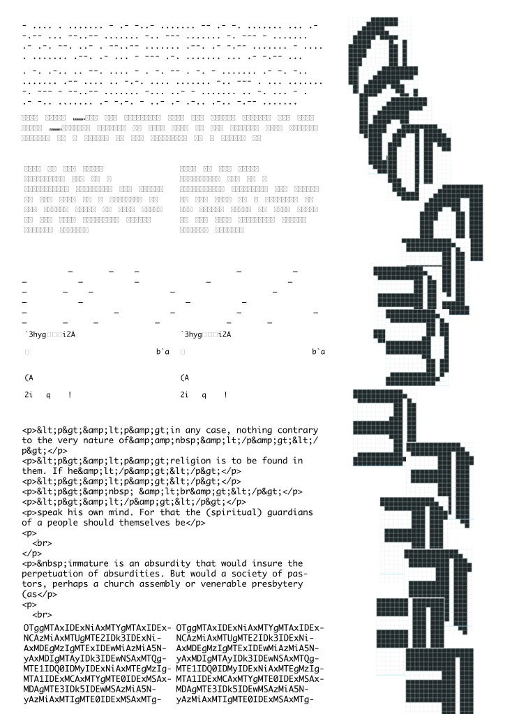
Initially inspired by how Gutenberg created multiple glyphs per letterform to convince monks to utilise his newly invented letterpress in the creation of their bibles, I set out to create an Opentype font that I could then use to typographically explore Kant’s “What is Enlightenment”. I knew I wanted my audience to be digitally located but after refining my idea, I realised I was communicating to a computer, which I labeled “the digital immature – the unenlightened”. I thought it was interesting how Kant talked about how someone “is not free and cannot be such because he is acting under instructions from someone else”. This instantly made me think of how computers are coded and follow a strict set of instructions to operate. I know it wasn’t the point of the brief but it nicely fits the theme whilst subverting it and provided a useful thinking point to further develop my typographic explorations. I used the font Gutenberg A, a blackletter font, and attempted to merge it with the sharp, digital font “Steps-Mono” (found on Velvetyne). Through my multiple glyphs made using Fontstruct, I planned to create a gradient of the transformation and fusing of the two fonts which would be presented in an OpenType font. I then planned to introduce an element of procedural generation and random number selection when Kant’s text would be translated, with each glyph being selected semi randomly according to a computer programme to represent the letter. I thought my outcome could be performative. We could witness the computer being the audience to kant’s text and through a video or a parallax scrolling webpage, or kinetic typography, present this sci-fi narrative. We could watch this in real-time. This led me to think about conditional design, generative design, and creative coding. It was unrealistic to create a full font in the time frame, especially as I was making several different versions of each letterform.

As such, following a critique, I decided to focus on “rehearsing the conditions” of my design which would directly dictate my final visual outcome. I shifted my thinking. I proceeded to look into how we typographically communicate with computers and the conditions behind it. This instantly brought me to the idea of code. My outcome is derived from looking at different forms of how text (all taken from Kant’s work) can be translated into code. I look at the effect certain programs and processes meant to be utilised within a coding environment can dictate the visual language of typography, one which is not engineered for human processing, but that of the machine. I decided to print my text scroll which came from how computers are coded in long, everlasting documents, on tracing paper. I felt this stock emulated the flat screen, and it’s semi-transparency, opened up the possibility of shining a light through it, much like how a screen is lit up. I utilised many different online generators such as http://www.unit-conversion.info/texttools/hexadecimal/
https://www.browserling.com/tools/text-to-hex
https://www.quackit.com/html/html_generators/html_text_generator.cfm
https://www.ascii-art-generator.org/
It was interesting creating multilateral communications in which something would be converted from text into something else and then back to text. Errors and glitches occurred. For the base composition of my piece I used an ai image to code generator meant to be utilised to create websites from notes, it picks out and removes information it deems unnecessary for its coding which influenced my visual outcome greatly. Does this piece of typography created for and derived from the computer hold up as a functioning design for our readability and processing?
Below is my final outcome both in its physical and digital time.


It was great presenting my outcome to the group. I received some Criticism. Firstly I was told that my work explored lots of contrasts – black and white, physical and digital. I was told that the entanglement of the two was a really strong aspect of my work but that it could be further developed. I was also told by a fellow student that it would be really great to see the piece digitally in some aspects. Finally, I was told that my audience “a computer” was too broad. However, we quickly thought of some more honed in instances where this work could be displayed. We discussed how this visualisation of digital type would be effective within the science museum. We picked upon the aspect of code and thought about also presenting it in somewhere like “The Alan Turing Institute” where this was really celebrated.
It was great seeing everyone else’s pieces, I was blown away by the variety of outcomes. No two ideas were the same and there was something that could be drawn from every one. Some people used animation software to present text digitally. I wonder if any of their approaches would have helped me in my communication.
Even after completing this project this area continues to be of great fascination to me – not only typography but also generative art and design, articles like this really fascinate me:
https://www.itsnicethat.com/articles/harm-van-den-dorpel-digital-071019
We are learning about modernism at the moment in out critical historical studies lecture programme. Part of the modernist philosophy was to use the latest technology. This type of design really feels cutting edge in this regard, within this realm of – augmented/virtual reality, artificial intelligence with software such as “deep learning”, generative design and creative coding. I look forward to see it’s effect on design, it’s a very exciting time.
