After I had a basis for my idea I drew from some designers that I already knew. I’ve always found April Greiman, John Maeda and Johnathon Branbook. All 3 work closely with digital technology and the onscreen-image I wanted to find some new designers to inform my research and influence my project.
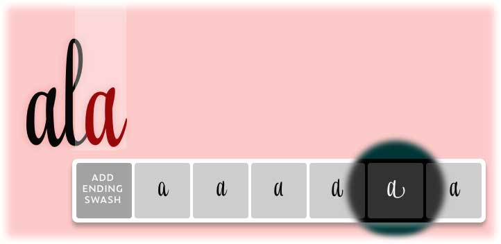
This is an example of open type – or a type face with multiple different characters for each letter. It’s a way of adding a human touch and awareness to a digital font.
https://www.underware.nl/fonts/liza_lettering/preface.
My research then took me to fonts that use conditional design. This is design where you formulate the condition to dictate the outcome.

“The battle cry of the RandomFont: Beowolf. The answer to the Bezier shock of the early nineties. Now that we have achieved technical perfection, which factors determine the shape of our shapes? The question, in the days of retina displays, is still pertinent.
Drawn and engineered in 1989, Beowolf demonstrated that digital fonts are data and code; instructions that can modify themselves. Beowolf was part of the first FontFont library release. A collaboration between Just van Rossum and Erik van Blokland, as neatly announced in their publication “LettError”
This animation was produced as an exhibit for the Digital Fonts exhibition at the MoMA in New York in 2011. Together with 22 other typeface families, MoMA acquired FontFont Beowolf for the Architecture and Design collection. The letters animate differently in each red, green and blue channel, thus creating many colors in overlap. The animation was created using the original PostScript data, with a helping of contemporary Python and QuickTime.”
This led me to an artist who does a similar thing but visualises his conditions into 3D graphics. His outcome is dictated by conditions he puts upon the digital creation space.

I explored this further by looking at how computers make type as opposed to the physical techniques of the letterpress. Digital type is made up of points. These points could all be manipulated through code – they just become another piece of information.

https://www.metaflop.com/modulator

Exploring and extracting modular design – making it the focus of the design.

This brought me to “conditional design” a thoery and manifesto made popular by this group of designers and their studio.
https://conditionaldesign.org/


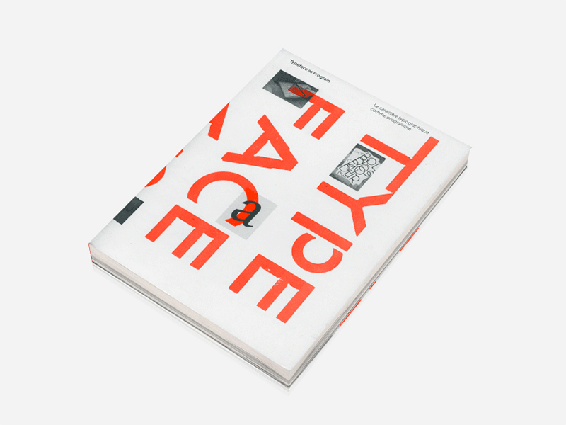
Typotheque is a studio that created “webfonts” below is a publication of some of their digital fonts brought into the physical print space.
https://www.typotheque.com/articles/typeface_as_programme


“The Nature of Type Design in the Digital Age
Like many disciplines dependent on technology for execution or production, type design has undergone a series of fundamental revolutions and transitions in the past century. Driven by technological advance, this process has completely changed the way people work with type, to the point where someone employed in the field had to adapt to a significantly changing situation multiple times throughout a career. At the beginning of the transition there was the 19th century hot metal typesetting with its very complex and expensive mechanised equipment invented by Monotype and Linotype. A period of opto-mechanical photocomposition systems followed in the 1950s and 60s, in which printing with cast letter-forms was replaced with exposure of optical outlines on spinning disks of glass onto light-sensitive paper. This was soon replaced again by the digital simulation of similar processes, formulated in computer programs and executed first by huge room-filling installations and later by affordable home computers.”

OCR-A is a font that arose in the early days of computer optical character recognition when there was a need for a font that could be recognized not only by the computers of that day, but also by humans.[2] OCR-A uses simple, thick strokes to form recognizable characters.[3] The font is monospaced (fixed-width), with the printer required to place glyphs 0.254 cm (0.10 inch) apart, and the reader required to accept any spacing between 0.2286 cm (0.09 inch) and 0.4572 cm (0.18 inch).
Now I Need to just hone in my audience and context. I used the vague term before my audience is the “digitally immature”. I wonder if my audience could be a computer, I could input the text in my font, which the computer could then process and make another output. I talked to Marcus about this and he said my context could be “a science fiction narrative” or even a ” performative feedback loop” in which we see the computer realise the text in real time. I need to create a sense of why. I need to look more into how a machine would read some information. We mentioned the two different meanings of the word performativity which “is a complex concept that can be thought of as a language which functions as a form of social action and has the effect of change.” For example if a Policeman were to tell you to stop what you were doing that would be a law binding command – it’s official. This way of thinking through communication of statements and commands can be applied to how computers receive information through code.
